Shopify · Growth
7 Shopify Conversion Wins That Do Not Require a Redesign
Practical storefront improvements that reduce friction, strengthen product discovery, and help more visitors reach checkout.
CartLabs editorial team
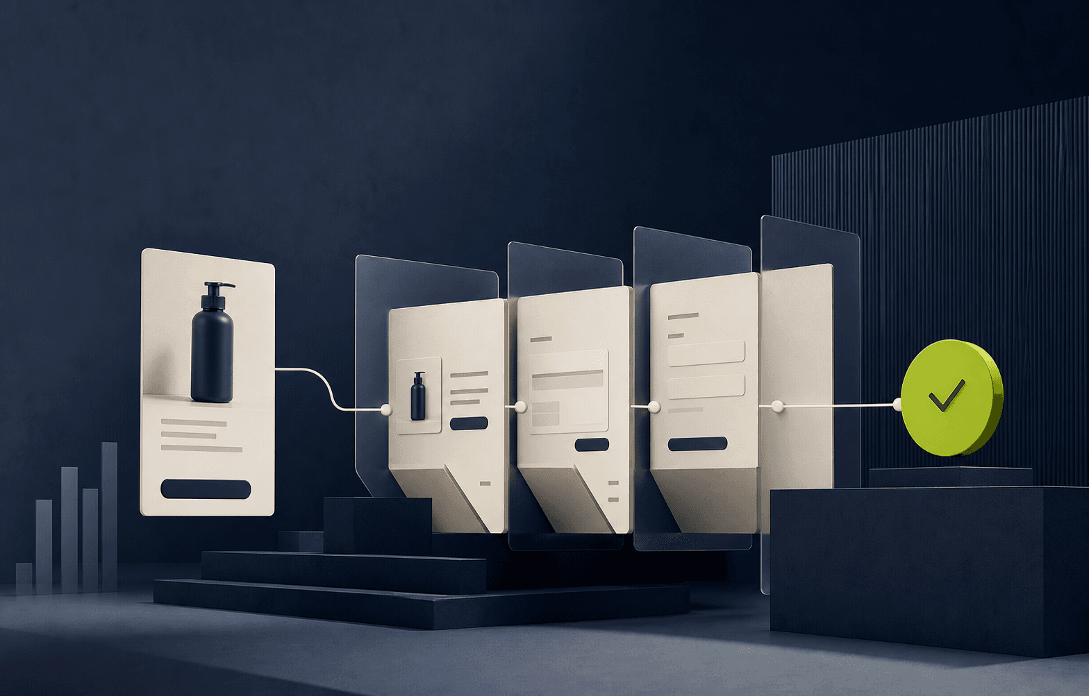
A full redesign can be valuable, but it is rarely the only path to better conversion. The fastest gains often come from removing small moments of uncertainty across product discovery, product pages, cart, and checkout.
Key takeaways
- Prioritize clarity before visual novelty
- Treat mobile as the primary buying journey
- Measure one commercial question per change
Start with the moments that block a decision
Customers do not experience your storefront as a collection of templates. They experience a sequence of decisions: Is this relevant? Is it right for me? Can I trust it? What happens next?
Review the journey around those questions. A clear delivery promise or better variant state can outperform a dramatic visual refresh because it resolves a real purchasing hesitation.
Seven focused improvements
Look for changes that are visible to customers, measurable in analytics, and small enough to release safely.
- Clarify the value proposition above the fold
- Make collection filters useful on mobile
- Show variant availability before selection
- Place delivery and returns near the buying decision
- Improve image order around customer questions
- Keep the cart focused on completion
- Remove avoidable app scripts and interface noise
Ship in a sequence you can learn from
Group related fixes into small releases rather than changing the entire funnel at once. Establish the baseline, define the expected behavior, and review both conversion data and customer signals after release.
The goal is not an endless list of tweaks. It is a repeatable optimization rhythm that turns evidence into a better shopping experience.
The strongest commerce decisions make the customer journey clearer and the business easier to operate.